Dashboards provide a consolidated view of your report data using charts and graphs.
Dashboards are divided into 4 categories:
- Sales dashboard
- Expenses & purchases dashboard
- Team productivity
- Cash flow dashboard.
Tο access the dashboards, click Dashboards from the main menu.
Sales dashboard
The Sales dashboard acts as a control panel, giving you a detailed and dynamic overview of your sales over a selected period.
Sales metrics
The top row of the dashboard displays the following metrics:
- Net amount (excluding all taxes)
- Total amount (including taxes, excluding any withholdings)
- Amount payable (total amount due, including taxes and withholdings)
- Percentage of Paid/Unpaid amounts
- Overdue amount (invoices past their due date)
A green/red arrow next to each figure indicates an increase or decrease compared to the previous period. Hover over the arrow to view the exact values and comparison period.

You can customize the dashboard results to suit your business needs.
Use the Period field to set a specific time frame for more targeted insights, and apply Filters to further refine the results.
You can follow the same steps to customize the Expenses & purchases and Cash flow dashboards.
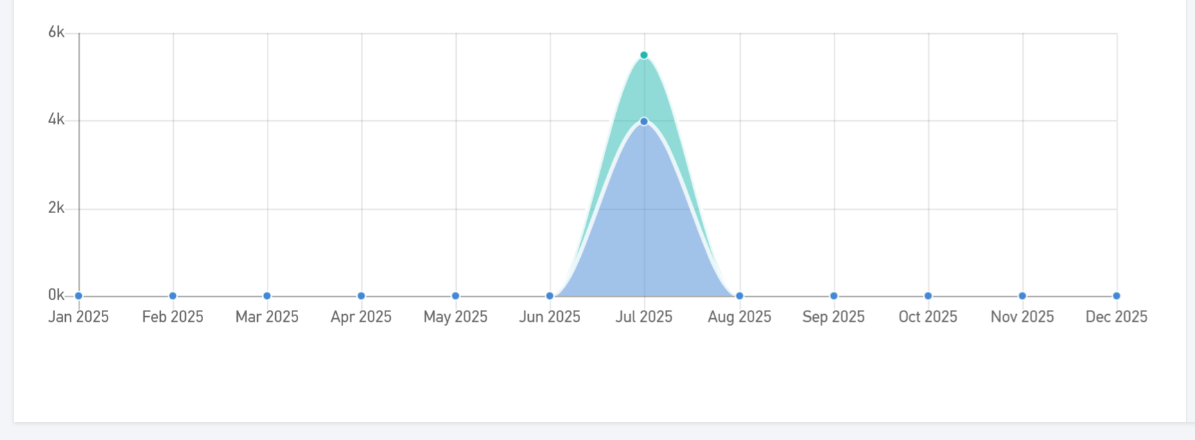
Sales analysis
The next section presents a visual breakdown of your sales for the selected period. Monthly sales are broken down by week, annual sales by month, and so on.
Secondary dimension of the sales dashboard
This section provides a deeper analysis of sales, either Per client (top 10 clients for the selected period), or Per tracking category. Hover over any data point for more details.
This allows you to compare current sales performance with previous periods and gain real-time insights into your business trends and growth.
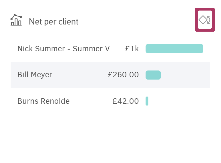
Sales per client, project or category
The final section includes three charts that give a complete overview of sales during the selected period:
-
Νet per client (top 10 clients)
-
Net per project (top 10 projects)
-
Net per category (top 10 categories)
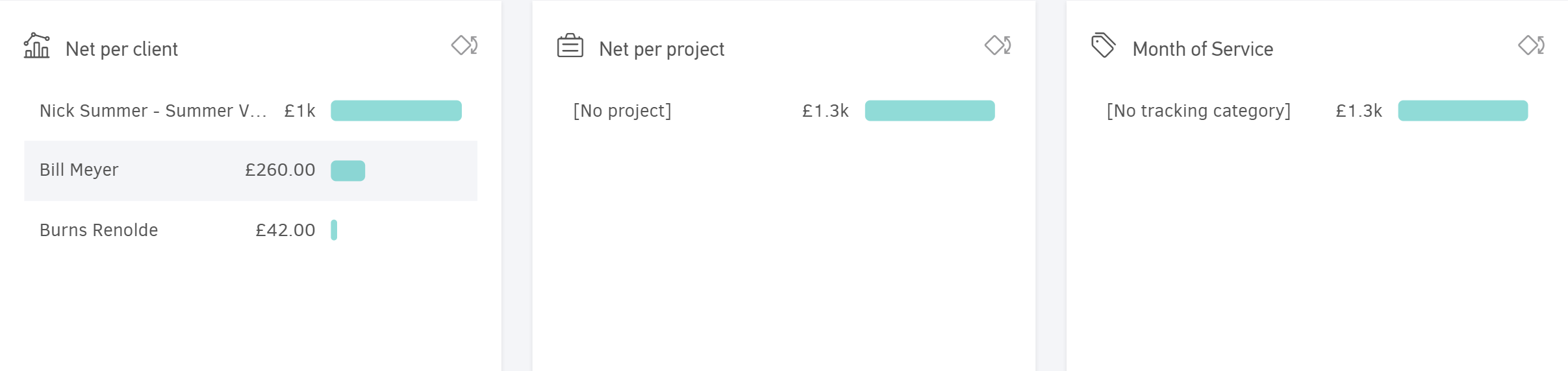
If you've created custom classifications, additional charts will be available.
Use the widget selector to choose which charts to display.
Expenses & purchases dashboard
The Expenses & purchases dashboard offers a dynamic breakdown of your business expenses & purchases over specific periods.
Expenses & purchases metrics
Similar to the Sales dashboard, the top row displays:
- Net amount (pre-tax),
- Τotal amount (post-tax, excluding withholdings),
- Payable amount (including all taxes and withholdings),
- Paid/Unpaid amount (displayed as a percentage)
- Overdue amount (past their payment due date).

Expenses & purchases analysis
This section uses charts to break down your expenses and purchases by week, month etc., depending on the selected time frame.
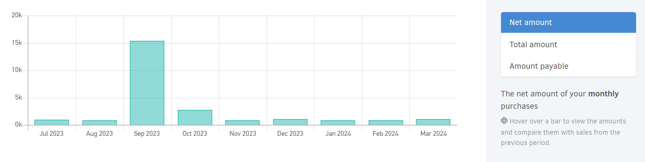
Use the toggle on the right to switch between net amount and unpaid amount.
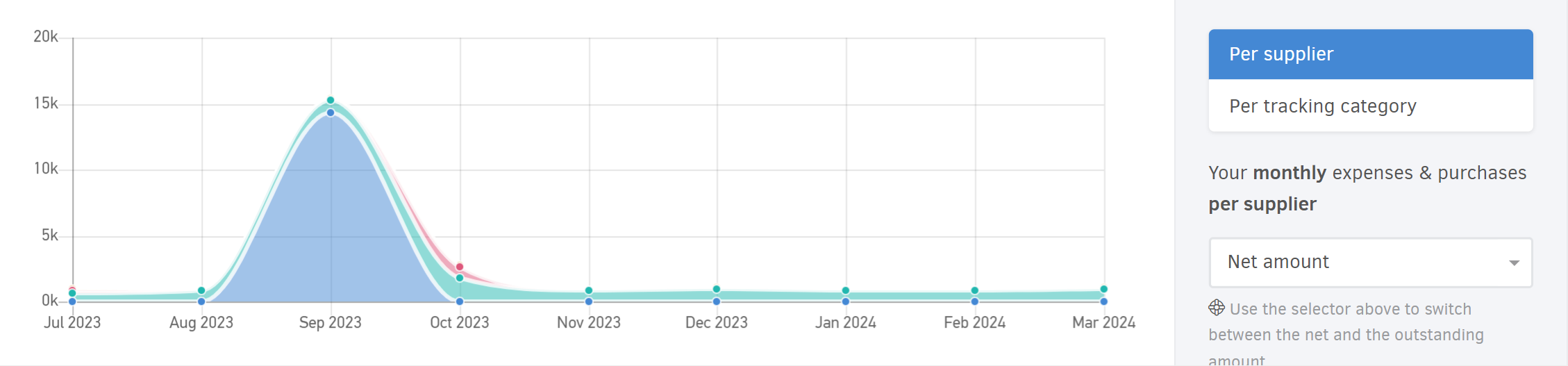
Secondary dimension of the expenses & purchases dashboard
Here, you get a deeper analysis either Per supplier (top 10 suppliers for the selected period), or Per tracking category. Hover over each point for more details.
Expenses & purchases per supplier, project, or category
The final section includes three charts offering an overview of your business expenses for the selected period:
-
Νet expense & purchase value per supplier (10 suppliers).
-
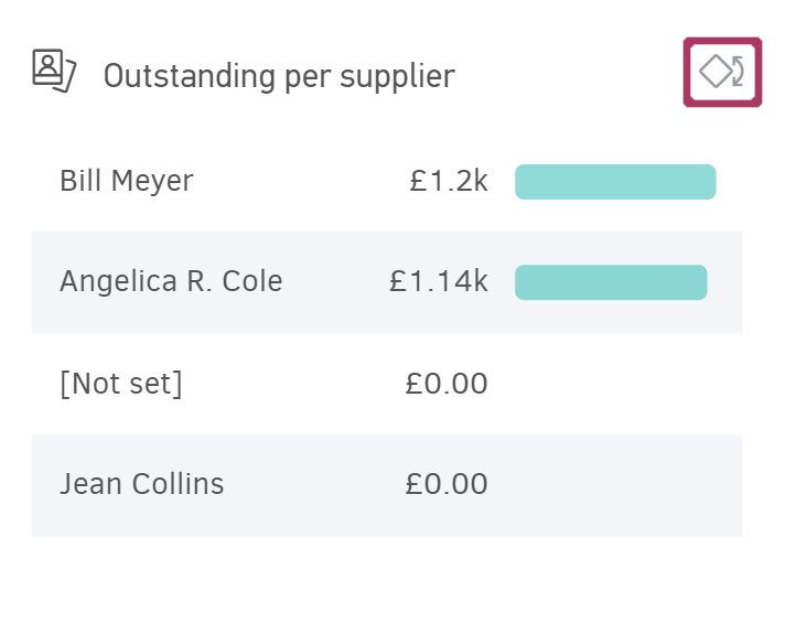
Outstanding amount per supplier (top 10 suppliers you owe the most).
-
Net amount per project (10 projects).
-
Net amount per category (top 10 categories).
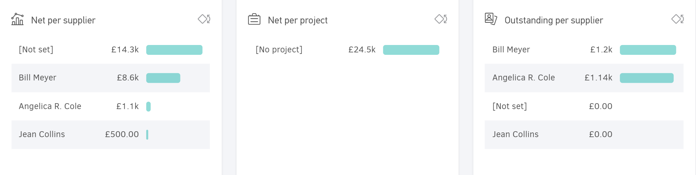
Additional charts appear if you've created custom categories.
Use the widget selector to manage which charts are shown.
Team productivity
This dashboard lets you monitor the total hours your team has logged across assigned projects. You can see how team members distribute their working hours per client, per project, per task, and per team (if configured).
Elorus displays this data vertically, either per user or for the whole team, based on your selected period.
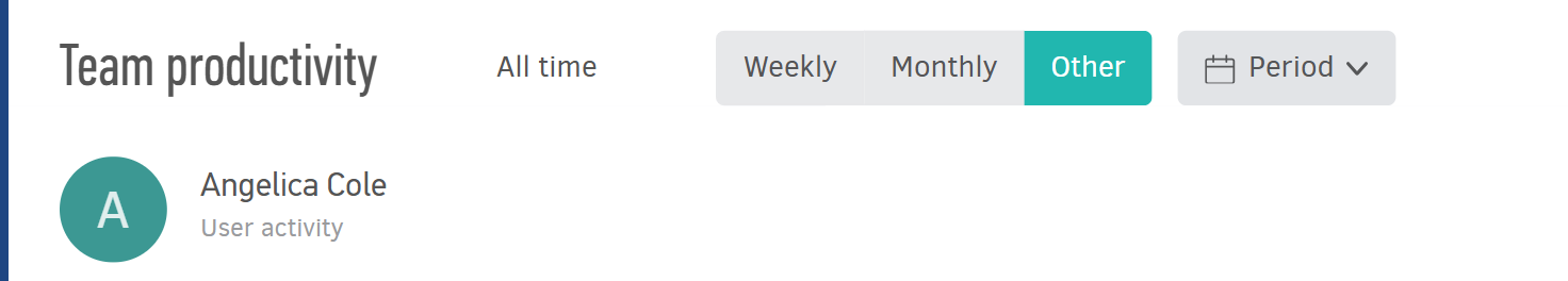
Period selection
You can view results by week, by month, or set a custom time period using the Other field.
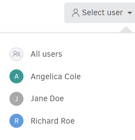
User selection
The results in the dashboard's charts and lists are displayed either per user or as a team total (all users), depending on your selection from the dropdown list.
Overview
When you select a user, Elorus shows the total Tracked hours, the percentage of Billable hours, and how many of them are Unbilled.

Progress chart
This chart shows how hours are distributed across projects, clients and tasks per week or per day, based on the selected period. You can view Total time or choose between Billable and Non-Billable time.
Only the top 10 results are shown in each category for clarity. All other data is grouped under Other.
Click any dot on the chart to see time logged per client/project/task.
Hours per client, project, or task
Below the chart, there are three tabs where logged hours are grouped per client, per project, and per task.
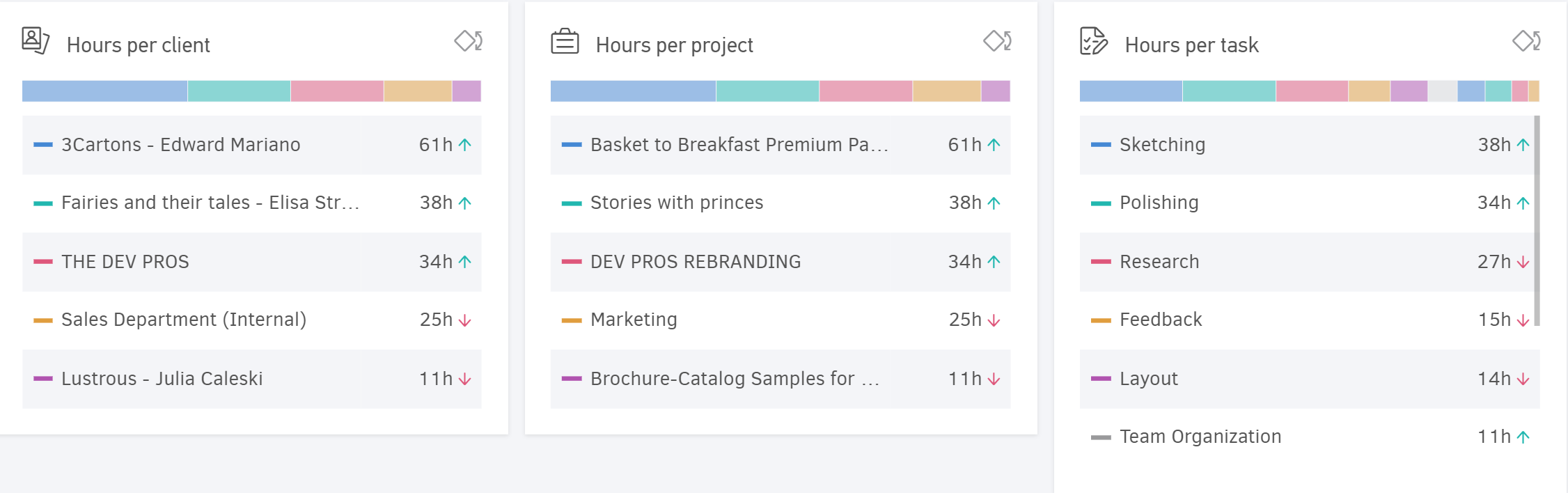
Hours per client: The hours logged for a client across one or more projects.
Hours per project: The working hours for each project.
Hours per task: The hours logged for individual tasks within projects.
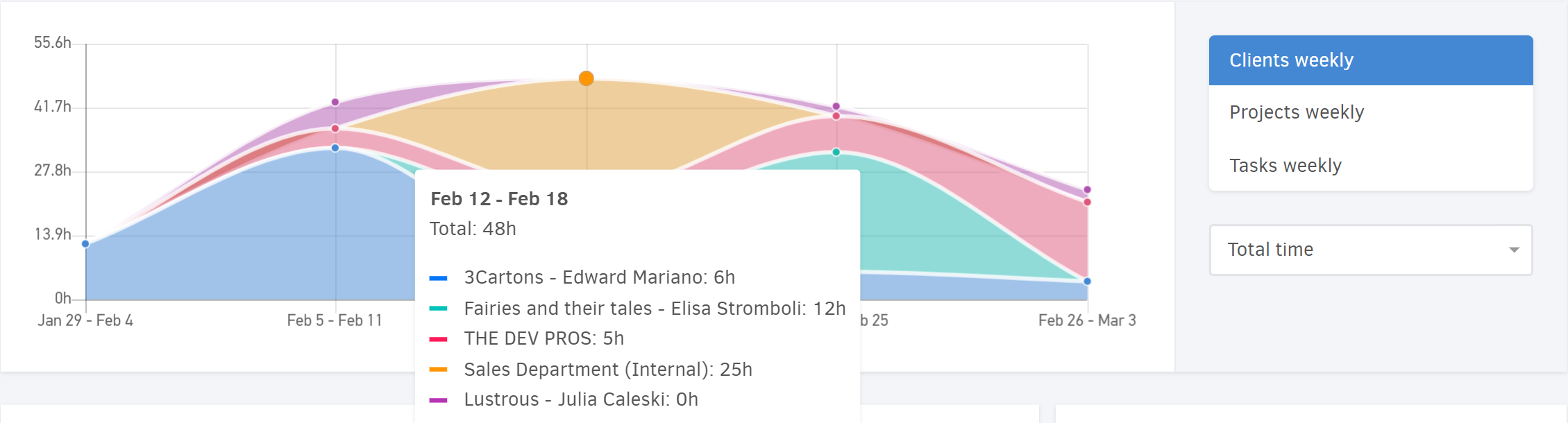
Time financials
At the bottom of the page, you can see how logged hours translate into billable amounts along with the cost to your business. This helps you evaluate the profitability of your projects and tasks, and the efficiency of your team members.
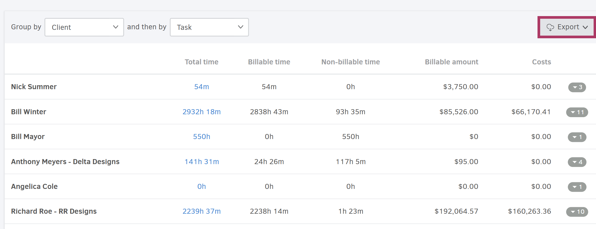
Combine any two of the above parameters for Grouping (primary and secondary). In the image above, the times recorded per client and per task performed for that client are displayed.
Clicking on any time summary takes you to the corresponding time report (detailed time recordings) to see detailed time logs.
Export the summary in Excel or PDF format using Export button.
Cash flow dashboard
The Cash flow dashboard provides insights into your business’s liquidity trends, including comparisons with previous periods. You can view the distribution of incoming and outgoing payments per client, per supplier, or per custom categories.
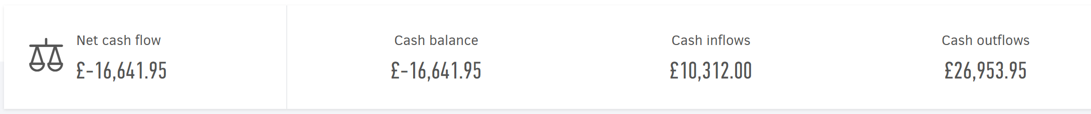
Cash flow metrics
The top section of the dashboard displays:
- Net cash flow (total difference between collections and payments/expenses)
- Cash balance (collections minus payments to date)
- Cash inflows (total income)
- Cash outflows (total payments and expenses).
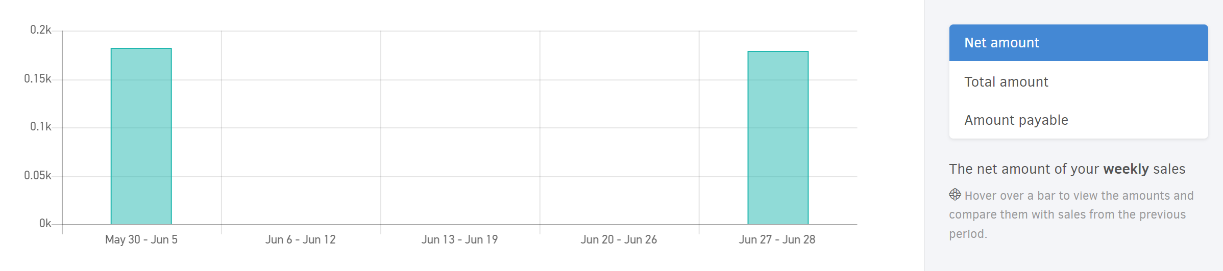
Cash flow analysis
The first chart breaks down your cash flow over the selected period by year, month, week, or day.
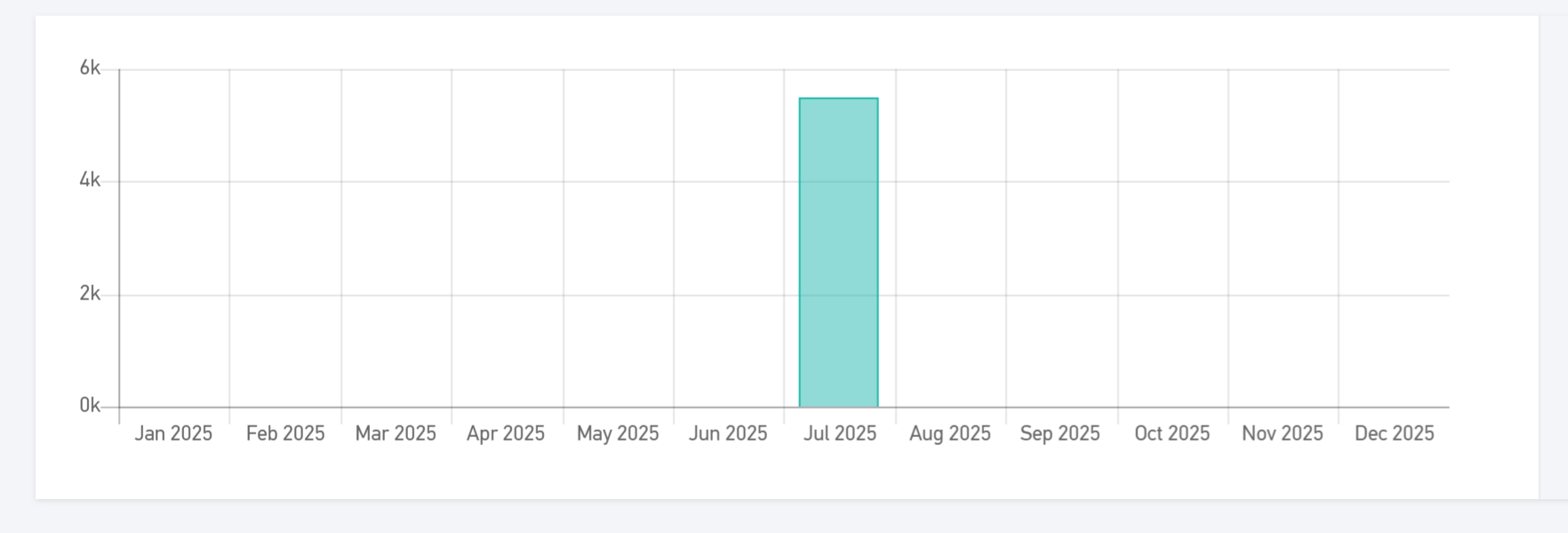
Hover over a bar in the right section (Cash flow change or Cash inflows & outflows) to view amounts and compare them with the previous period.
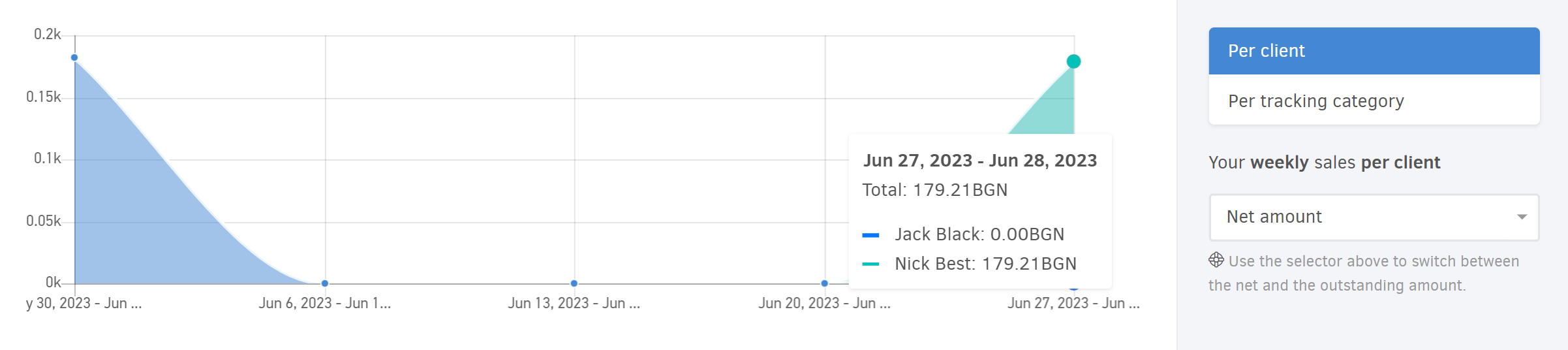
Secondary dimension of the cash flow dashboard
The second chart provides a secondary dimension of analysis.
-
Cash flow breakdown per Client: View the distribution of cash flow changes for the top 10 clients during the selected period, based on the analysis interval. The chart includes incoming transactions such as "Client Payment," "Income," or "Other Payments", as well as outgoing transactions like "Client refund".
-
Cash flow breakdown per Supplier: See the distribution of cash flow changes for the top 10 suppliers during the selected period, based on the analysis interval. The chart includes outgoing transactions like "Supplier Payment" or "Other Payments", Expenses, and incoming transactions such as "Supplier refund".
-
Cash flow per tracking category: Monitor cash inflows and outflows for each custom category you’ve created, within the selected reporting period. Use the dropdown field at the bottom of this section to choose the desired category.
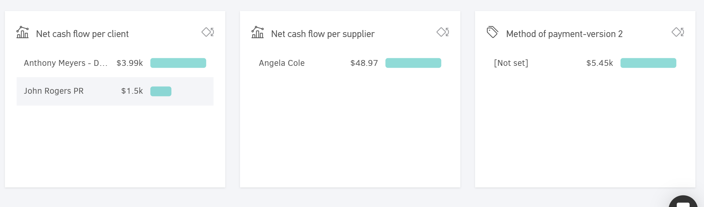
In the last section of the Cash flow dashboard, three different charts provide a comprehensive overview of the cash flow for the selected period.
The information includes:
- Net cash flow per client, displaying results for the top 10 clients.
- Net cash flow per supplier, displaying results for the top 10 suppliers.
- The amount of Payments received for the selected period, by transaction type.
- The amount of Payments sent for the selected period, by transaction type.
- The Net cash flow for this period by tracking category, showing the top 10 values within the category.